

This post was originally posted on my attempt at a science communication blog, Probably Interesting. I moved it over here in March 2026 so I could have everything I’ve blogged about in one place. It also explains why this wasn’t posted on a Sunday. In the case of this particular post, it’s the last thing I posted over there, so “next time” never came. Maybe it will one day.
It’s been a couple of weeks since the last post, since my maths blogging time last week was taken up by writing the transcript to my podcast about Bayes’ Theorem and the law. But now we can finally answer the question of: in the Erdős–Rényi model, what happens in the critical regime?
If you haven’t yet read the first two parts, where’ve you been? No matter: you can catch up below.
It turns out that the answer is that the largest component has size that, as grows, scales like —so this is somewhere between the supercritical case, where it scales like , and the subcritical case, where it scales like . But there’s actually a little more to it than that. The precise distribution of the limiting size of the largest component—and the second-, third-, fourth-, fifth-, etc., -largest components—was pinned down by David Aldous, in a paper of 1997. This is a paper that, to my mind, is an example of beauty in mathematics.
There’s been research that suggests that mathematicians respond to certain results in the same way that humans in general respond to a picturesque view, say, or a great work of art. Wikipedia has an article on different sources of mathematical beauty, featuring (at time of writing) a quote from Paul Erdős himself.
Mathematical beauty, like any other kind, is somewhat subjective, but to my mind an example of a beautiful result would be one that connects things together that are seemingly unrelated. Aldous’ result from 1997 is such a result: it connects our random graphs to an object that, at least in definition, is totally unrelated: Brownian motion.¹ So let’s take another digression and see what that is.
You might remember Brownian motion from school, but probably not from maths lessons: it’s part of the secondary school Physics curriculum (or at least it was back in my day). There, it’s defined as the random motion of a particle suspended in a fluid, as observed under a microscope, which was first observed by Robert Brown in 1827. This was explained in 1905 in terms of, and as evidence for, molecular theory, in one of the first scientific contributions by Albert Einstein—although earlier in the same year he also published a paper explaining the photoelectric effect that won him the Nobel Prize, so describing it as “one of the first” perhaps understates it. (Later the same year he defined the field of special relativity, and came up with the equation ; it was described as his Annus Mirabilis, or “miracle year”.)
What we’re going to look at is actually a mathematical abstraction of Brownian motion, which is sometimes, to distinguish it from the physical counterpart, referred to as a Wiener process (named after the American mathematician Norbert Wiener). The literature I’m familiar with calls it a Brownian motion, though, since there’s little risk of the reader thinking any particles are involved, so that’s the name I’ll use too.²
I don’t want to get too bogged down in the definition of Brownian motion, because it’s intensely technical. In particular, a typical thing to do in an undergraduate course about this is to define it as the unique process that has certain properties—but then you have to prove that a process with those properties even exists at all. (It does, thankfully.) I think the best thing I can do is show you a picture.
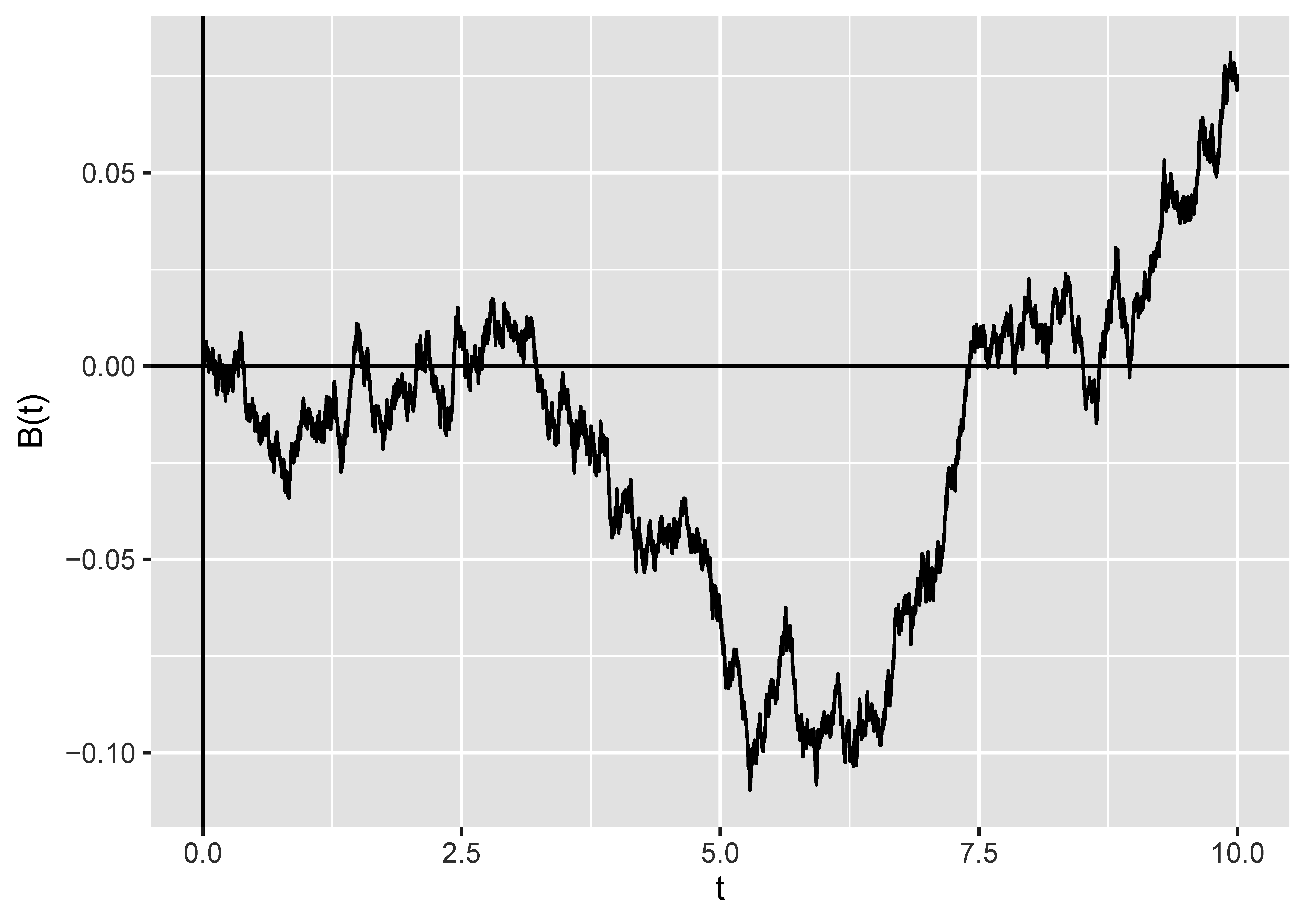
As you can see, it looks a little bit like a stock market graph. There are some things to notice.
- It has no particular drift in any direction. Sure, it’s gone up overall, but it started off with a downward trend, and in future it could just as easily maintain any trend as reverse it. (We tend to talk about Brownian motions as running for a particular time, showing time on the -axis, and starting at .
- It’s continuous: there are no jumps in value.
- It’s a very jagged, un-smooth³ path. In particular, it actually has fractal-like properties: if you zoomed in on any portion, you’d see something that looked just as jagged.
Brownian motion has a lot of applications in the theory of stochastic (that is to say, random) processes—indeed, you can model the behaviour of stocks using something that is based on Brownian motion. It’s not obviously connected to random graphs.
The connection actually comes through the breadth-first search that I mentioned last time. Let’s set up some notation: let represent the number of vertices discovered by exploring edges in step of that process. This is also the number of vertices woken up in that step, with an important caveat: if we wake up a vertex because it’s the lowest-labelled one of a new component, we don’t count it towards any of the s. (This turns out to be crucial to making this work!)
Then, starting from , we define a process by . ( represents the number of vertices of the graph.) That is, on each step, we add on to our current value of the number of vertices we’ve discovered (if any), and then subtract one.
Let’s look at what this process does for the graph in the video from last time, which you can find on YouTube. Here there are ten vertices, so .
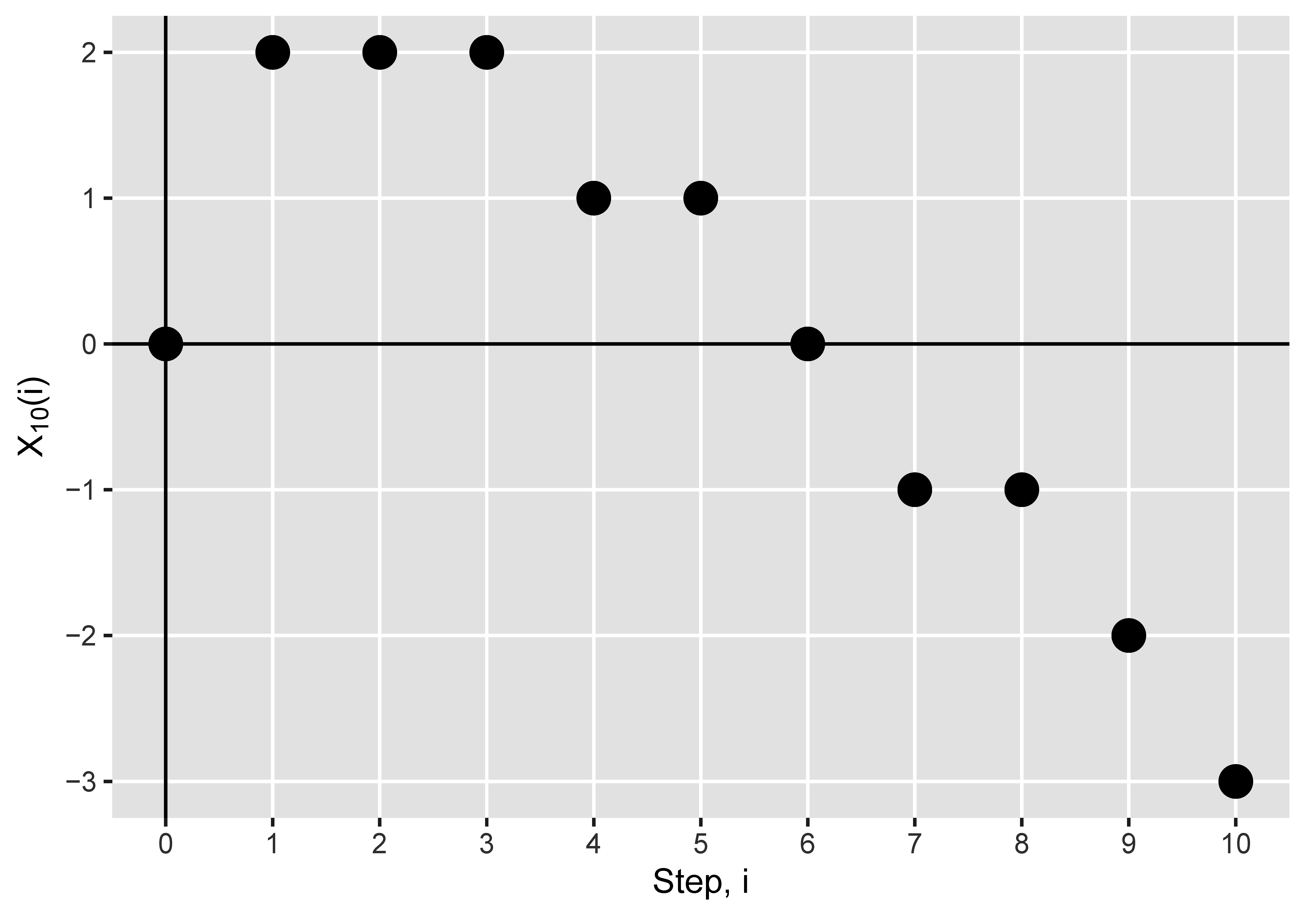
If you watch the video and follow along the graph, you’ll notice that, until the end of the first component, is one less than the number of awake vertices at the end of step —which is what you’d expect. Why? Because the number of awake vertices is initially —one more than our initial value of . And then in each step the number of awake vertices increases by the number of vertices we wake up, which is , and decreases by for the current vertex, which we kill at the end of the step. So the change in both the process , and in the number of awake vertices, is the same: they always differ by , but they move in lockstep.
There is always a positive number of awake vertices until the component ends, when there are . This means that stays non-negative (but could be zero) until the component ends, when it hits . So the first time we hit is the size of the largest component.
Then the whole thing starts again from the first vertex in the second component. So the number of awake vertices again moves in lockstep with , but they’re now offset by . And the first time hits is the end of the second component.
It repeats one more time for the third component, which only has one vertex, and so it hits immediately.
So the first time hits the value marks the end of the th component in the exploration. And thus the value of , which necessarily is the end of the exploration of the last component (remembering that we kill one vertex per step), is the number of components in the graph.
So the differences between the hitting times of negative numbers tells us the component sizes. How is this useful? Well, Aldous also proved something about how the process behaves. Let’s jump up in scale, and look at the process for ; we’ll show the first steps. Instead of showing dots for the values (which would all overlap on this scale), I’ve joined up the points with a line. The plot we’re interested in is in black: don’t worry about the red line for the moment.
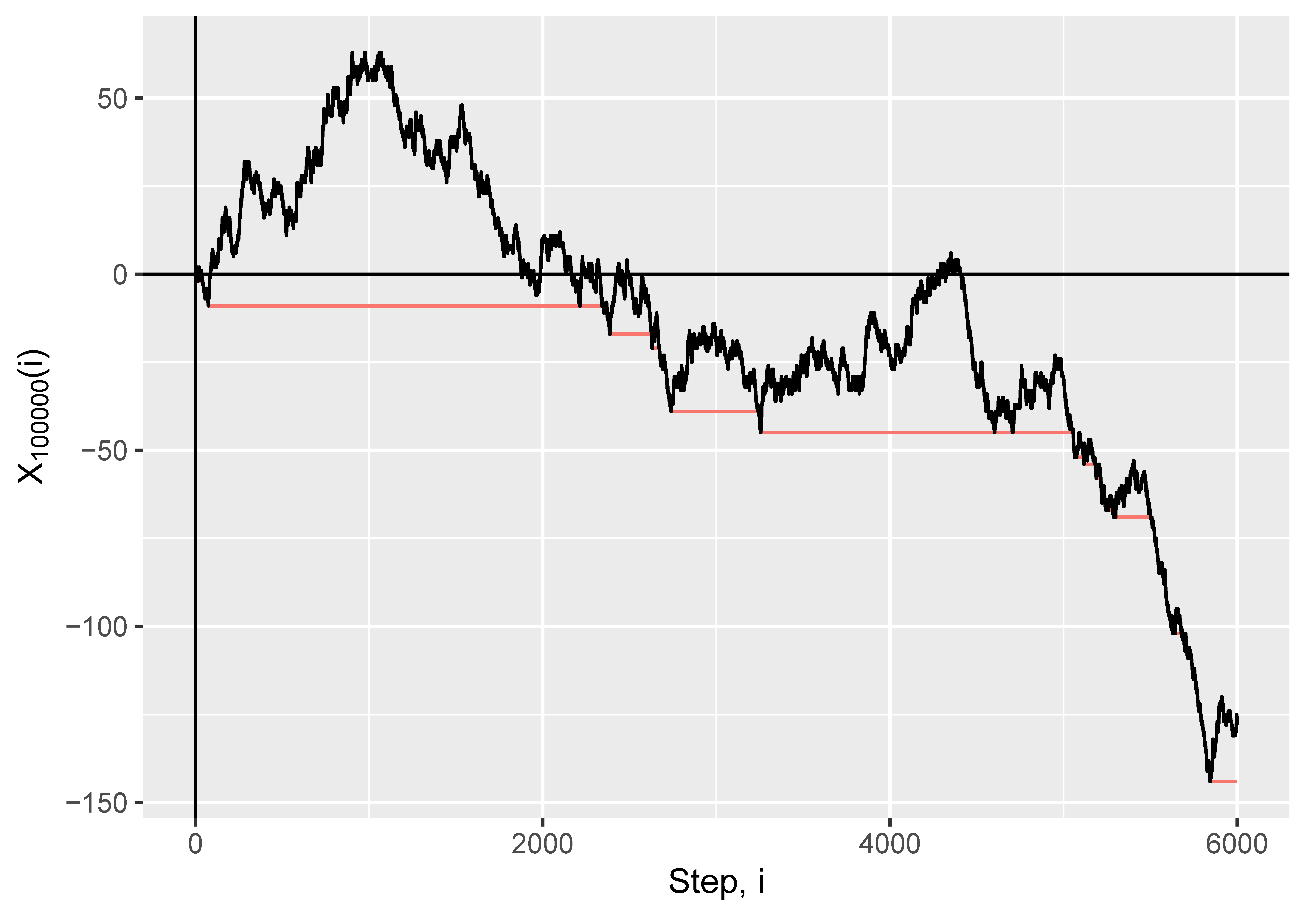
Does that look like a Brownian motion to you? It looks like a Brownian motion to me.
Okay, so it’s not quite a Brownian motion, for two reasons. Firstly, it’s not going to have that fractal wiggliness, because the process only takes values on the non-negative integers (whole numbers), which we’ve just joined up with straight lines. If you zoom in on the picture, you’ll eventually just see perfectly smooth, straight lines joining the points. But what we might hope happens is that if we draw this process for larger and larger graphs, and also “zoom out” at exactly the right rate, we’ll get more and more wiggliness so it looks closer and closer to a Brownian motion. This is essentially what happens, as we shall see.
The second thing is that there’s a negative drift here—and that might have happened by chance with a regular Brownian motion (there’s a 50/50 chance that the start point after any given time is less than ), but actually if you were to run this process multiple times you’d fairly consistently see a negative drift. The reason for this is, essentially, that the number of sleeping vertices that we can potentially discover is steadily decreasing as the exploration goes on, which pushes each to be smaller, and consequently pushes downwards by a greater and greater amount.
So what did Aldous prove? I’m sorry, but there are going to have to be some equations here! Let’s define
to be our appropriately “zoomed out” breadth-first process. ( means the “floor” of , or the whole number below ; so , and .) Then Aldous showed that, as gets larger and larger, looks more and more like a process , where
in which is a Brownian motion.⁴
Now, remember how in we had that each time we hit a new minimum we’d completed a component? Well, let’s take , at the end of a step , to be the minimum value reached so far, so we can keep track of that—so when decreases by one, we’ve just finished a component, and the component sizes are the time for which remains constant. That’s the red line on the plot above. Then it holds that converges to , the running minimum of the Brownian motion with drift—so it makes sense that the component sizes, as rescaled (or “zoomed out”), correspond to the times for which remains constant.
This isn’t quite immediate from the convergence already established, but in the paper Aldous showed that it’s true as well. Since the “zooming out” was by , we now know not just that the components are on the scale of , but something about what the distribution of the “something” must be for large .
That’s the sizes: what about the shapes? What, for large , does a component of this graph look like? That will have to wait for next time.
The plots in this graph were made in R, using the ggplot2 and igraph packages. I know from experience writing my thesis that images for these sorts of things are hard to find, much less with the appropriate copyright clearance to be used, and actually coding the breadth-first search to make that picture wasn’t the easiest thing in the world to do. So, in case there are any passing academics for whom this is useful: all the images in this post are available under a Creative Commons Attribution 4.0 International licence, which means you can use them for free for any purpose without asking me as long as you credit me and/or this blog.
¹ It actually connects both to a third object defined in yet another distinct way, called the “multiplicative coalescent”, but I’m not going to cover that here.
² It’s also never called “the motion of Brown”, as in the title of this post, but the first two posts’ titles started with “the” and I wanted to continue the pattern.
³ I know the opposite of “smooth” is “rough”, but “rough path” has a specific meaning.
⁴ Technical maths details for those interested: the convergence is in distribution, with respect to the supremum norm on finite intervals.
Leave a Reply